When creating the logo for this event, I wanted to communicate the aspect of growth and beauty that the event offers to attendees. I went with a font that communicated femininity and had a handwritten quality to it to reflect the individualism this event stands for. I went with pink to represent femininity and teal to tap into the growth aspect without being too on the nose with green.
For ads I went with designs that could be placed around the events location. These formats allow for locals to be introduced, and reminded of the event. They would also become city wide branding once the event starts.
Once at the event, this is some of the way finding that attendees would interact with. With these designs my main focus was clear communication.
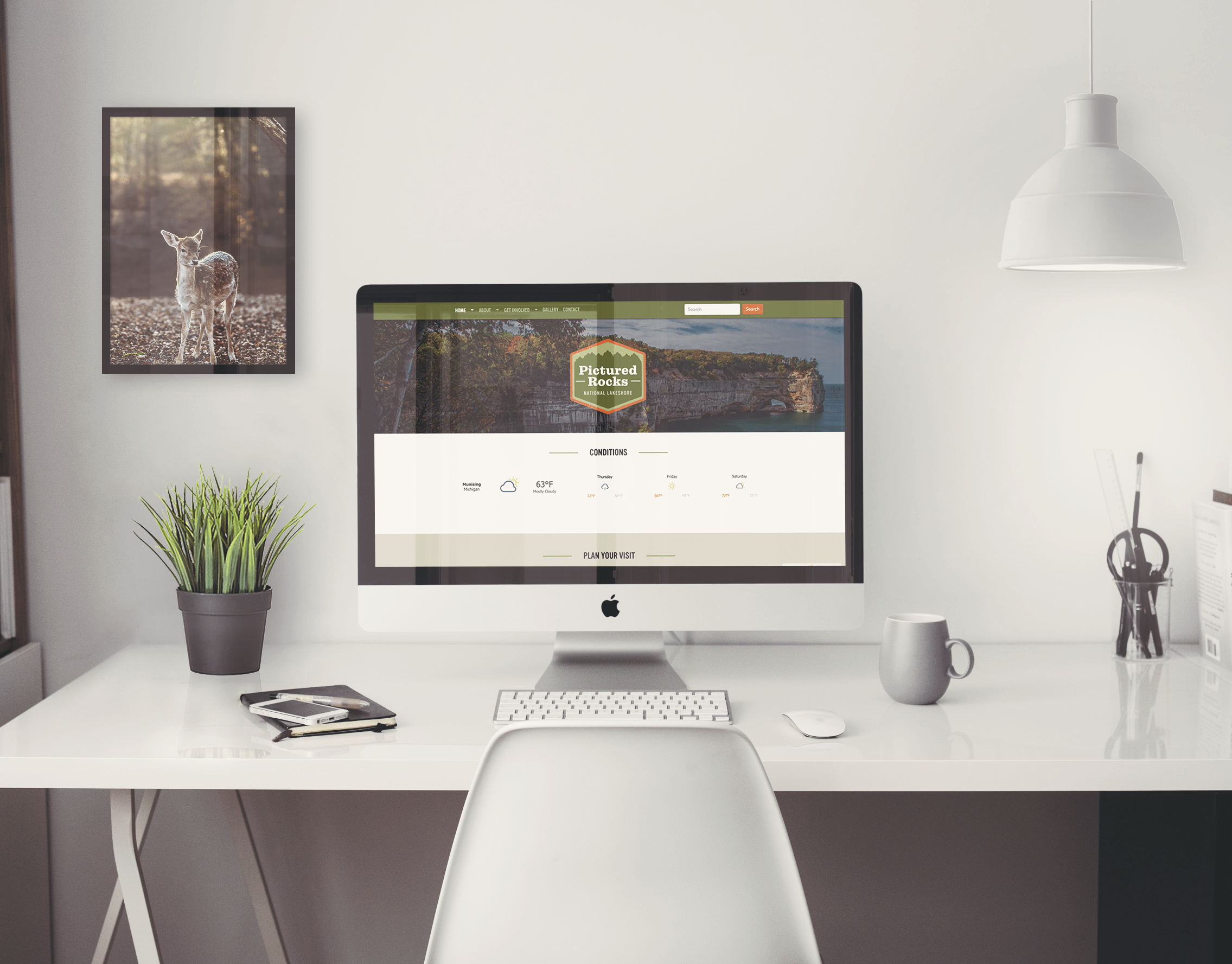
Moving to the more technical side of this campaign… I created a web ad to communicate to a broader range of people and a website that the web banner would take them to.
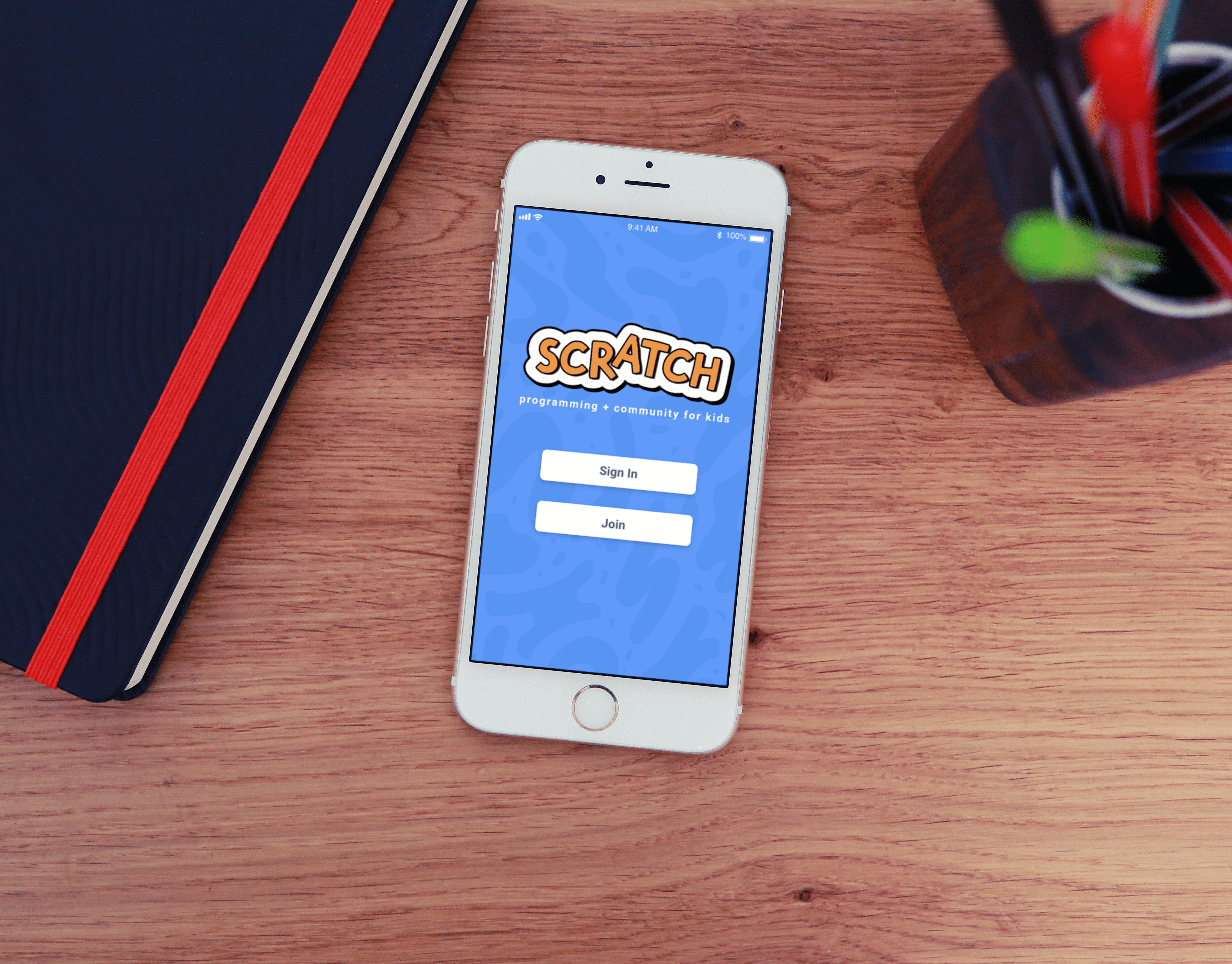
A mobile app was also created for the event. It features an instagram integrated social media feed of photos taken at the event, a way to see what events are happening, and a way to track the events the user is interested in.
Thank You!
