When designing the logo, my main goal was to communicate calm, safe, helpful, and friendly. I went with rounded type to communicate that safe, friendly vibe. For the color palette I decided on monochromatic blues. Blue is a very calming color and also represents safety and security.
When designing the application, my goal was to maintain that calm feeling for users. I wanted people experiencing panic to have an option for help before even logging in… so they could get help immediately if it was needed. Once logged in, the user has access to even more help including preventative measures, education, and emergency help.
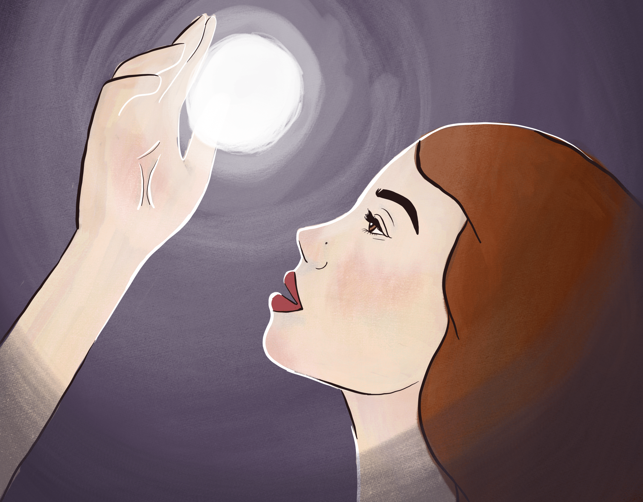
Here is the motion graphic I designed to be an instagram ad. When designing this ad I wanted to communicate that Solid ground is a tool to help users when they need it. My goal was to communicate empathy and frame Solid Ground as somewhat of a friend to lean on.
Thank You!
