When creating the logo for this park, I really wanted to create something that, out of context, would read Park. I went with a badge-like design and featured pine trees that are very popular in the landscape. I decided to go with fonts that had some texture to them and gave a traditional yet fun feel. For colors, I pulled inspiration from the parks landscape. The greens are inspired by the trees during summer and spring, and the orange is inspired by how some trees change color during fall here in Michigan.
For advertisements I went with a billboard design, since this is a travel location many drive to, and web banners since we we were revamping the parks online presence.
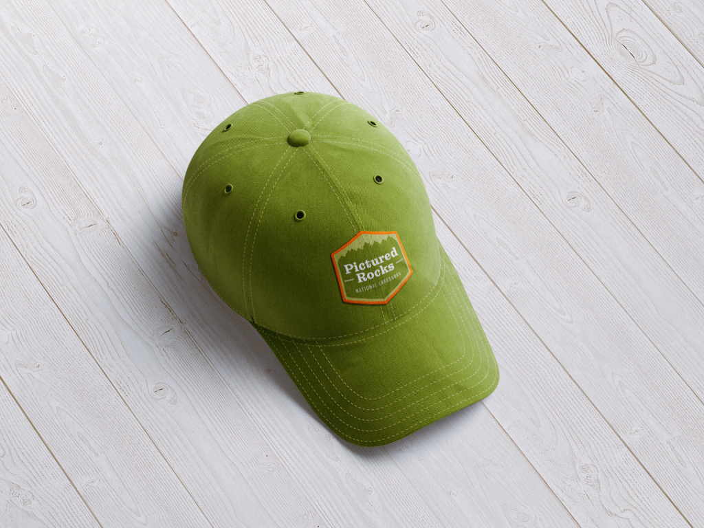

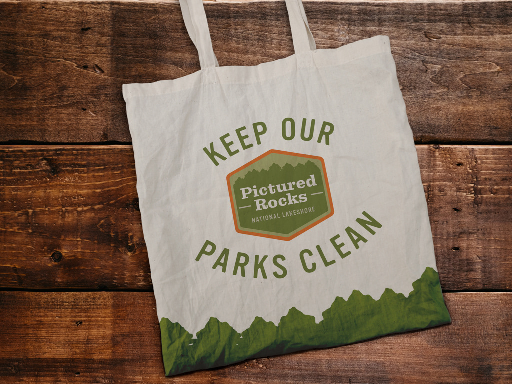
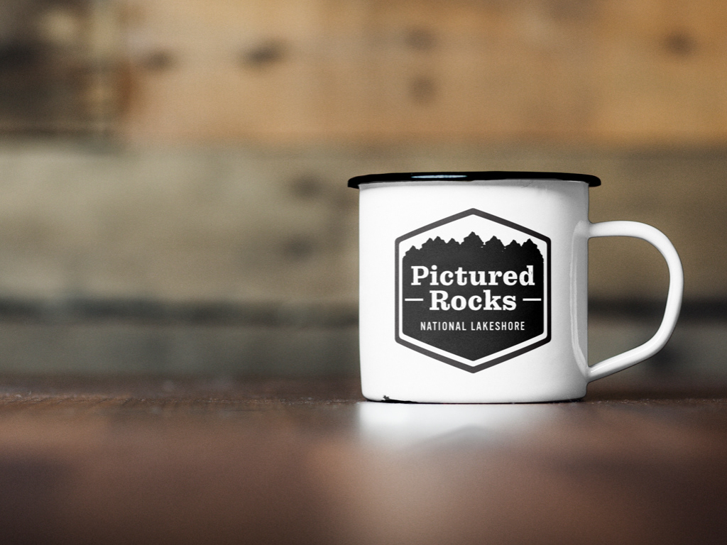
I designed the uniform that non rangers would wear. I decided to go with a baseball hat featuring the logo as an embroidered patch and a polo shirt featuring the same embroidered logo. I also designed some merchandise that people visiting the park could utilize. A re-usable bag featuring the tree-line design and communicating one of the parks messages of care for the landscape. And a tin cup that campers can use while camping. These tin cups are durable and fire safe, so they can be used on a campfire.
The website was designed to be responsive, so that it was accessible for users no matter what device they were accessing the site from. The intent with the redesign of the site was to make the information less intimidating and easier to navigate while also reflecting more of the personality of the park.
Here is a video walkthrough of the website. If you'd like to check the site out for yourself, feel free to follow the link below!
Thank You!
