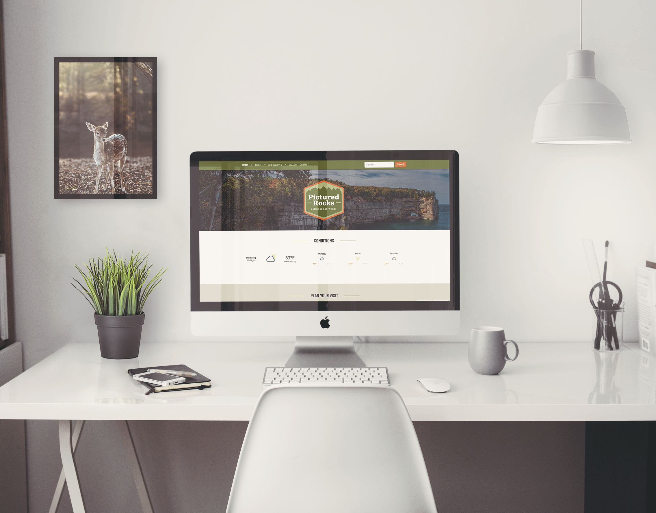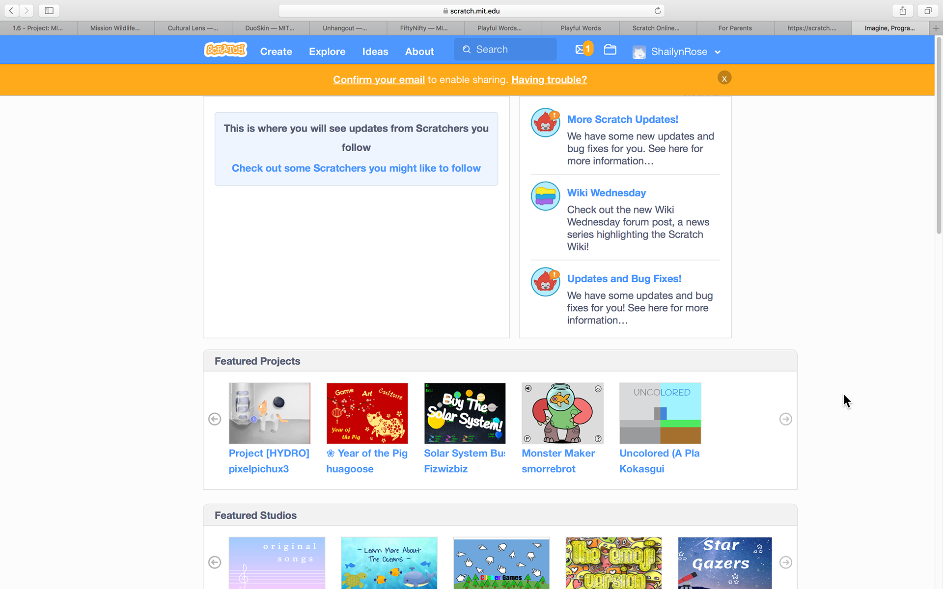

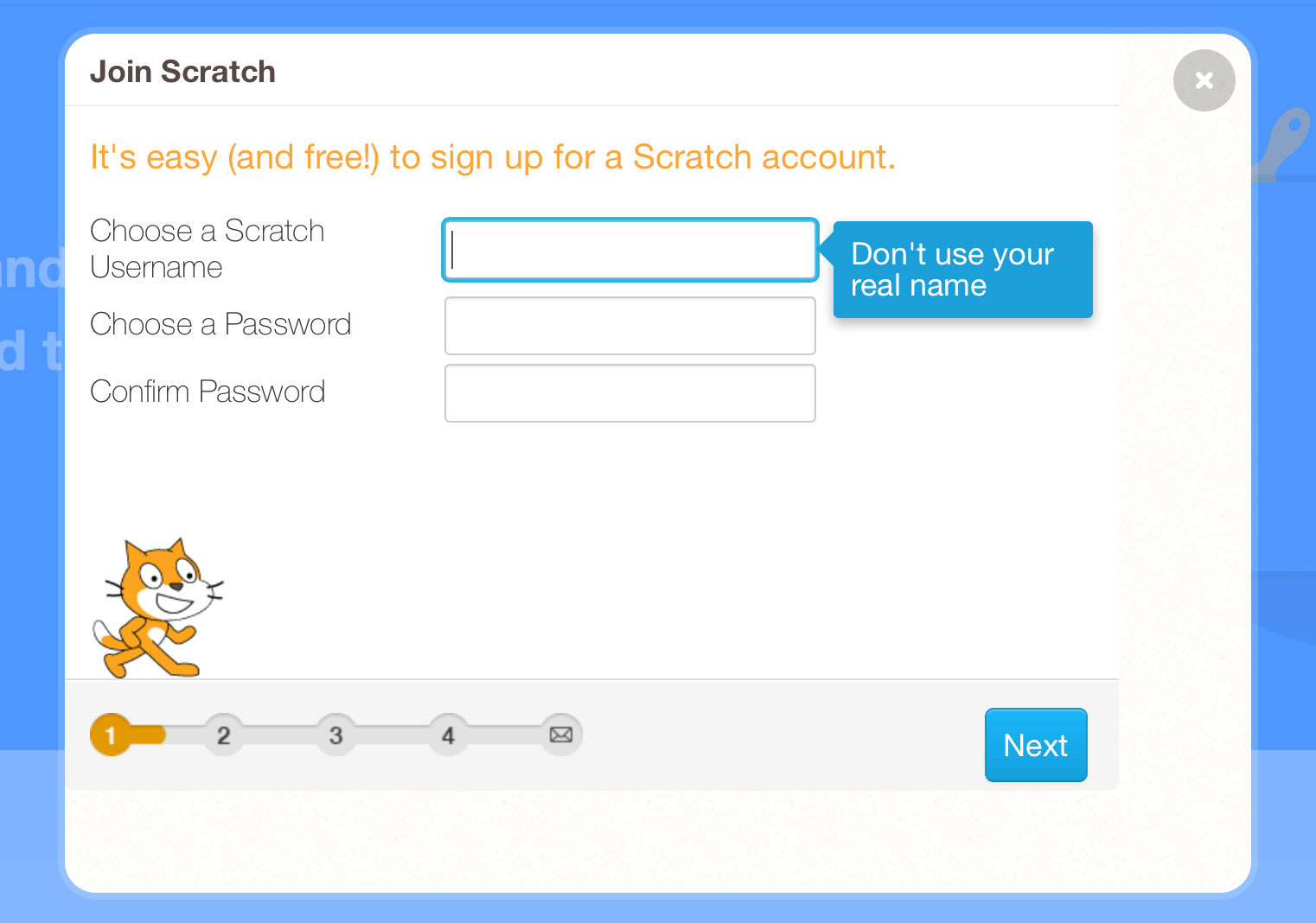
For reference, above are some screenshots pulled from the current web design. You can check out their site here: https://scratch.mit.edu/
When designing this logo, my perspective was that I was giving the brand a bit of a facelift… the brand already had a logo, but since I was tasked with pushing their brand further, I looked at redesigning their logo as a way that I could modernize their brand with the release of their new mobile app. I stuck with their branded colors from their website, but updated the font to look more modern and communicate tech a bit more.


For the ads, I tried to visually target the younger audience, while informationally targeting their parents. I wanted to communicate that Scratch is fun to the kids, but educational to the parents.
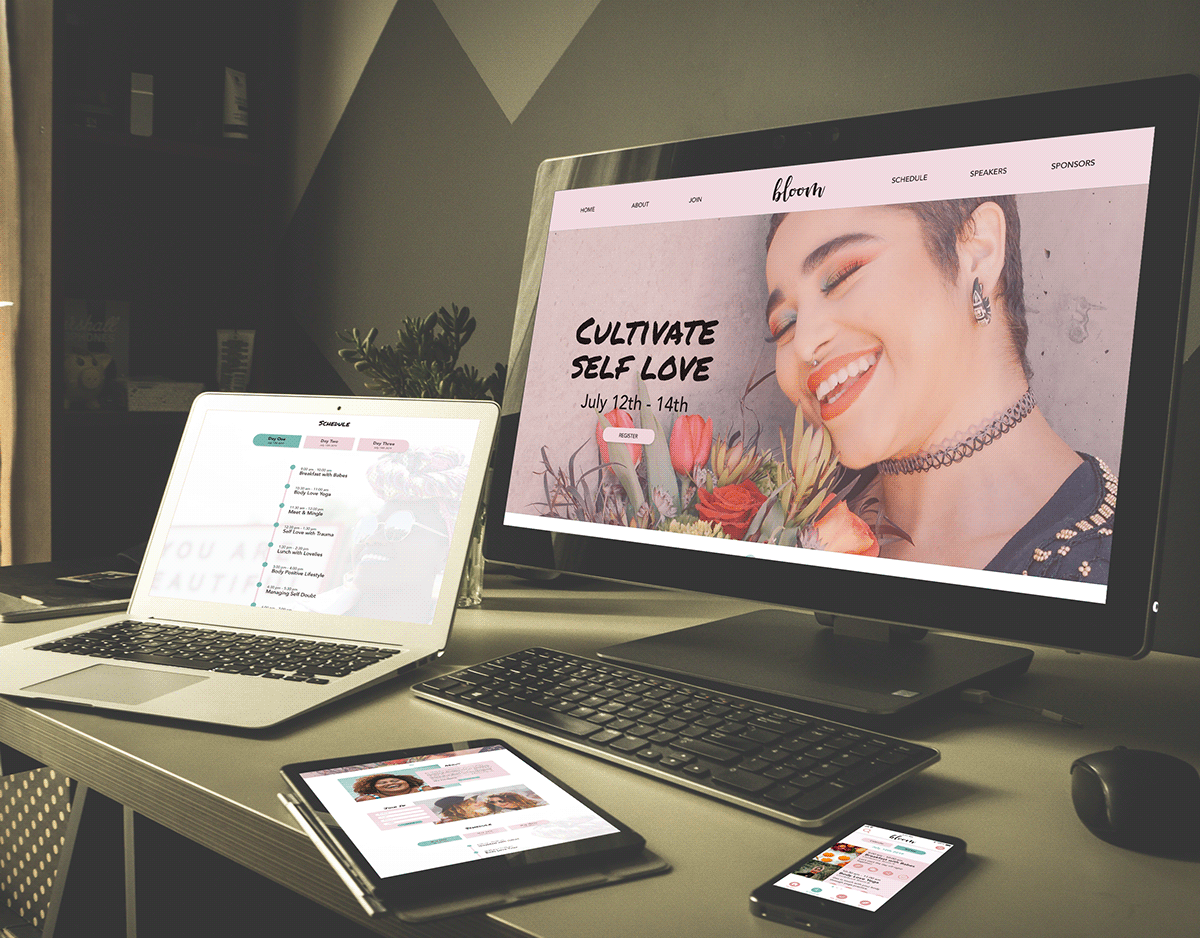
For the mobile app, I wanted to design it so that it really matched the website design, so that it could be a smooth transition for the sites users.
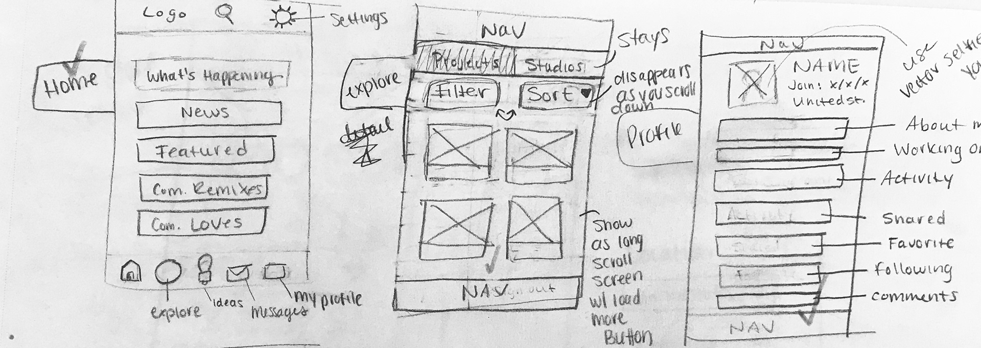


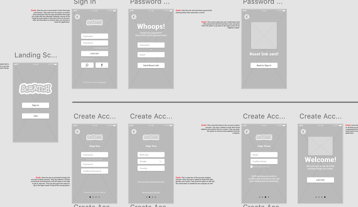
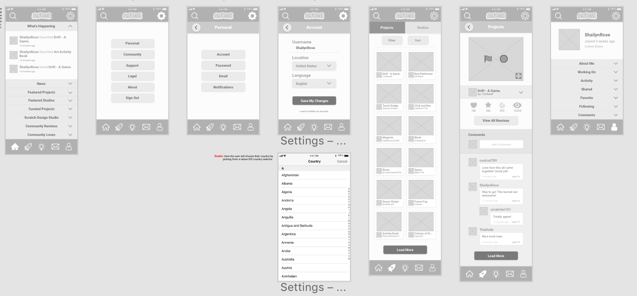
Here are some sneak peeks to behind the scenes... these are some photos of my process.
Thank You!
IOS language.png: https://support.apple.com/en-us/HT202178
Scratch profile picture: https://scratch.mit.edu/users/ShailynRose/
Email Icon made by Freepik from www.flaticon.com
Rocket Icon made by Freepik from www.flaticon.com
Home Icon made by Anton Saputro from www.flaticon.com
Idea Icon made by Freepik from www.flaticon.com
User Icon made by Freepik from www.flaticon.com
Search Icon made by Vectors Market from www.flaticon.com
Settings Icon made by Gregor Cresnar from www.flaticon.com
Heart Icon made by Sarfraz Shoukat from www.flaticon.com
Star Icon made by Smashicons from www.flaticon.com
Eye Icon made by Google from www.flaticon.com
Expand Icon made by Freepik from www.flaticon.com
Ellipsis Icon made by Google from www.flaticon.com
Pencil Edit Icon made by Freepik from www.flaticon.com
Thumbs up Icon made by Egor Rumyantsev from www.flaticon.com
The video thumbnails and profile pictures are those of the named user.
